CI / BI
ABOUT
CI / BI
CI Logotype
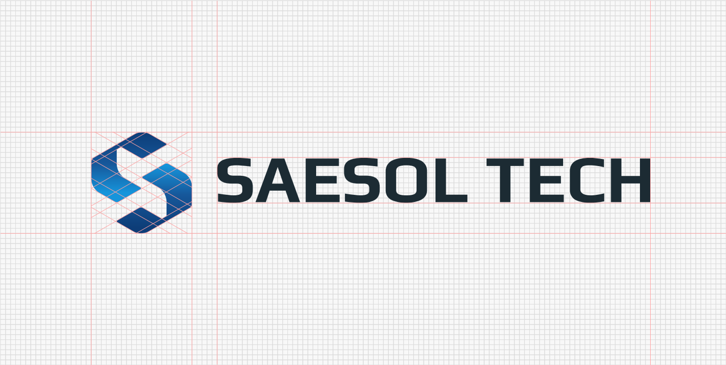
The SAESOL TECH symbol is based on the structure of the letter “S,” representing a modular security network where data intersects and flows.
The central space formed at the intersection symbolizes the core of a secure infrastructure where information is safely transmitted and connected.
Designed to visually convey connectivity and reliability in security technology, the symbol can also be extended as a brand pattern across various digital environments,
including social media and web platforms.
Typeface
Font: Play(Bold, Google Fonts)
To clearly communicate SAESOL TECH’s technical expertise and reliability, Play—a structured and well-balanced typeface—is designated as our primary brand typeface.

Symbol
The SAESOL TECH symbol is a visual representation of the seamless flow of our services.
Its distinctive form and color contrast ensure clear recognition across different environments while maintaining a consistent brand identity.
CI Color
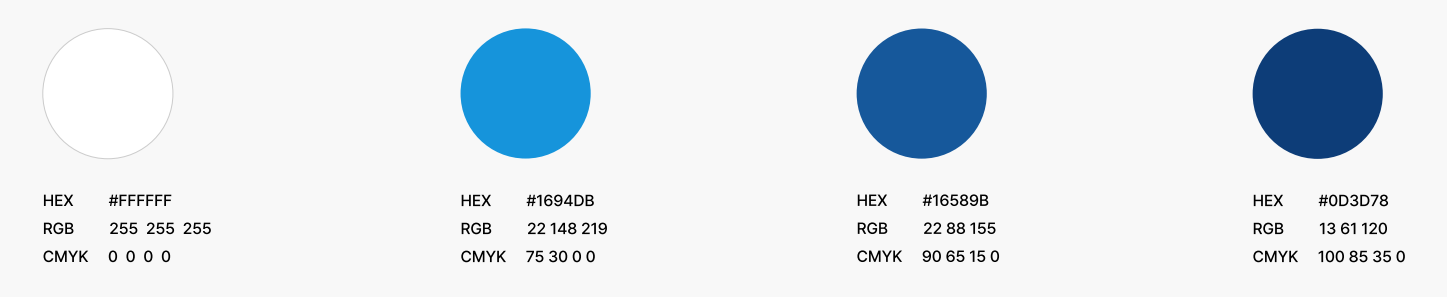
The blue gradient of the SAESOL TECH symbol visually represents the speed and security of data flow.
Its layered gradient reflects the depth and scalability of our security infrastructure while maintaining a consistent brand identity across digital environments,
including dashboards, websites, and favicons.
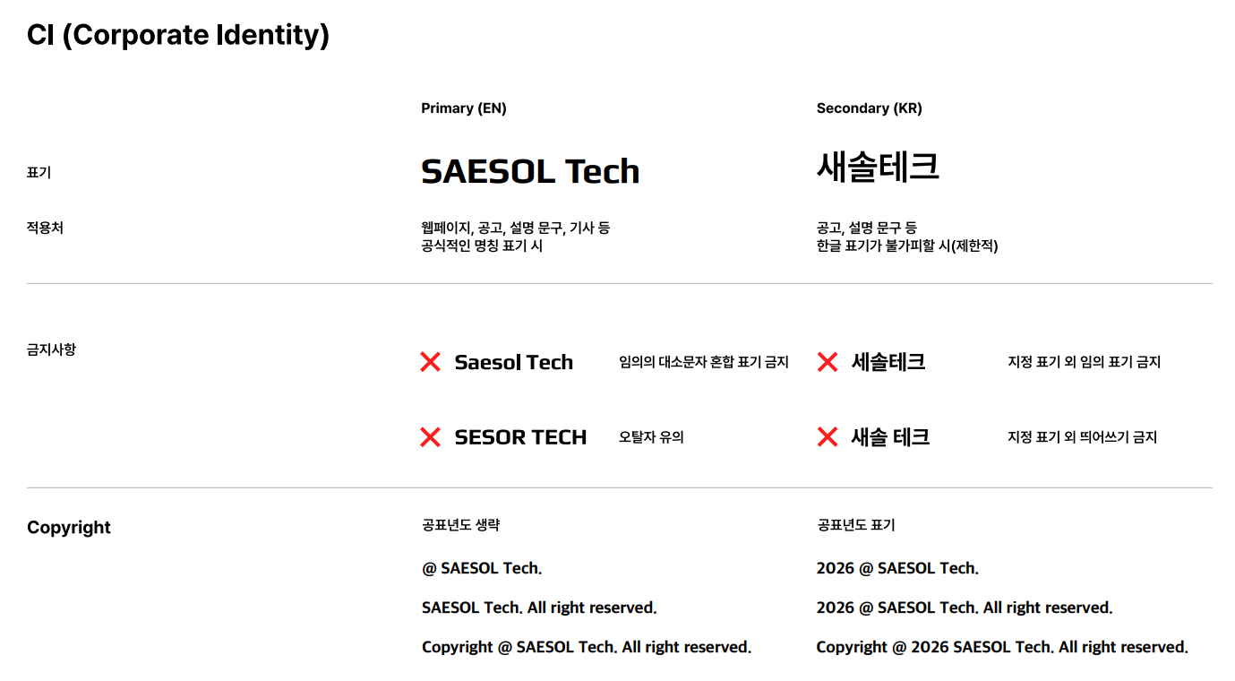
Marking Guide
These guidelines define the proper use of the SAESOL TECH brand name to ensure consistency and prevent misuse.
Please follow the guidelines to ensure accurate application across different communication channels.
BI Logotype
S2X BI embodies the meaning of “Secure to Everything, SAESOL to Everything,” representing SAESOL TECH’s vision of securely connecting every environment.
The “X” in the logo symbolizes an “X node” that connects diverse technologies and services, reflecting S2X’s role at the heart of an ever-expanding platform and security network for future mobility.